Get
CYBER
SAFE
Communications Security Establishment Canada is is the national cryptologic agency, providing the Government of Canada with information technology security and foreign signals intelligence – this means we talk about cyber security. CSE’s primary campaign is Get Cyber Safe, educating the general public about cyber safety and security. For the Get Cyber Safe campaign, I helped develop vibrant and engaging visual identities tailored to appeal to a youthful and broad audience, emphasizing the importance of cyber security through a whimsical and colorful design approach. The campaign visuals were designed to be eye-catching and fun, incorporating emojis and playful graphics to capture attention and make complex cyber security topics more accessible and engaging.
Each piece, from social graphics and blog post visuals to custom campaign branding for Cyber Security Awareness Month, was infused with bright colors and a dynamic aesthetic to convey the campaign’s energetic and educational message.
GET CYBER SAFE
Communications Security Establishment Canada is is the national cryptologic agency, providing the Government of Canada with information technology security and foreign signals intelligence – this means we talk about cyber security. CSE’s primary campaign is Get Cyber Safe, educating the general public about cyber safety and security. For the Get Cyber Safe campaign, I helped develop vibrant and engaging visual identities tailored to appeal to a youthful and broad audience, emphasizing the importance of cyber security through a whimsical and colorful design approach. The campaign visuals were designed to be eye-catching and fun, incorporating emojis and playful graphics to capture attention and make complex cyber security topics more accessible and engaging.
Each piece, from social graphics and blog post visuals to custom campaign branding for Cyber Security Awareness Month, was infused with bright colors and a dynamic aesthetic to convey the campaign’s energetic and educational message.
My roles and
responsibilities
At Banfield, I worked as a graphic designer for the “Get Cyber Safe” campaign for CSE, and I played a key role in crafting visual content that was both eye-catching and informative. My responsibilities included developing unique designs that adhered to the campaign’s brand identity while ensuring each piece of content was tailored to the specific platform it was designed for, such as blogs, social media, infographics, and website elements.
I worked on a team with copywriters, a creative director, and production designers to make sure that the work was full fleshed-out and complete from start to finish. I was a major part in designing the bulk of all print and digital assets for Get Cyber Safe and individual sub-campaigns. It was fun being a team player on a project where I got to lead the design.
Social
Graphics
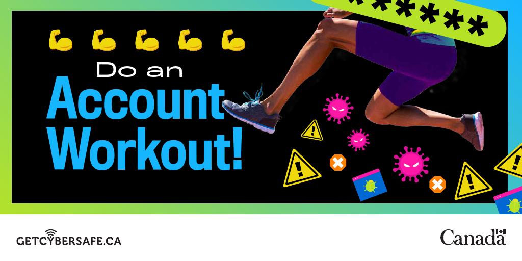
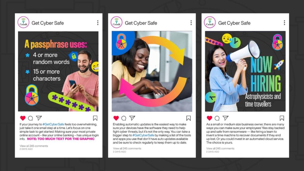
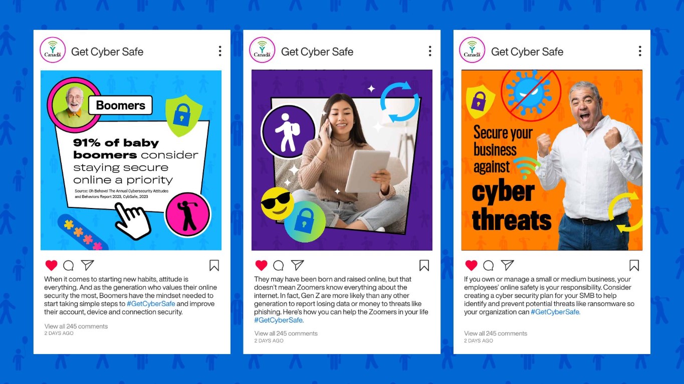
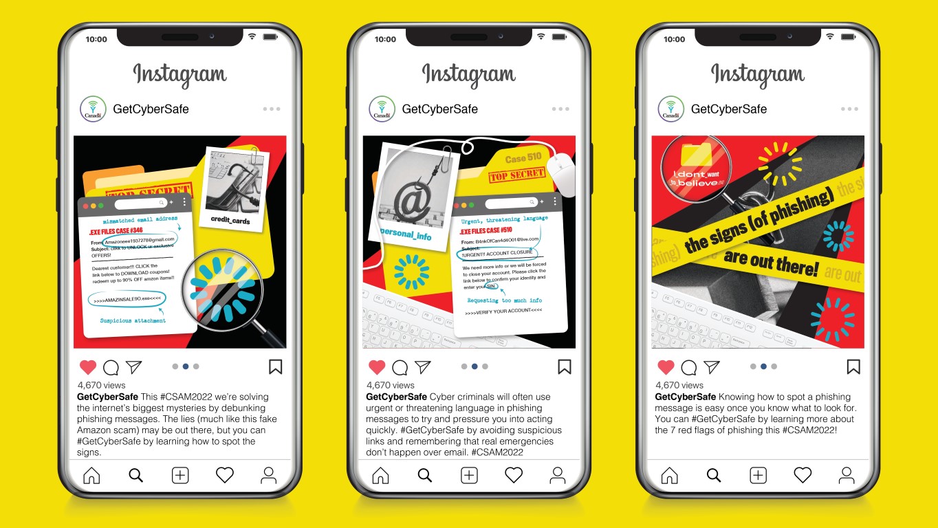
For social media, I focused on enhancing the already engaging and fun written content. By integrating a vivid and lively color palette with playful and whimsical elements, I ensured that the serious topics of cyber security were presented in an approachable and memorable manner. This effort not only complemented the writers’ work but also made the information more accessible and appealing to a wider audience.
Cyber Month
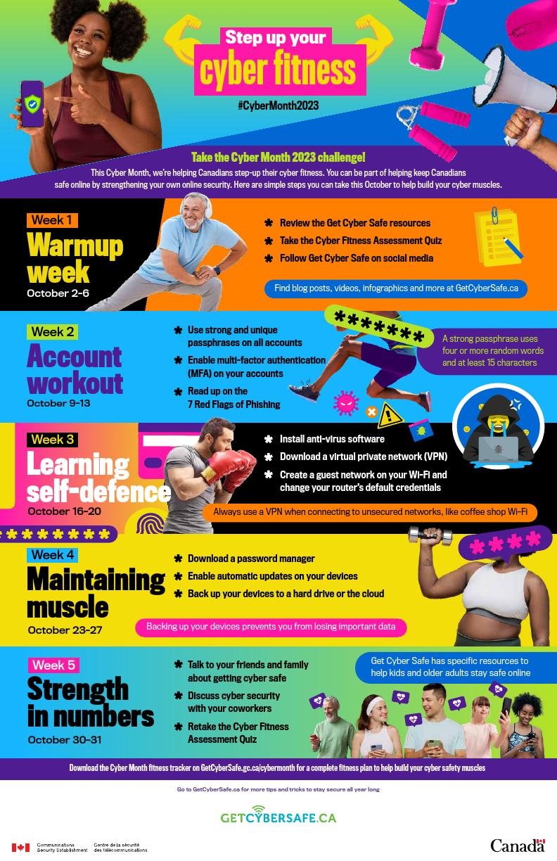
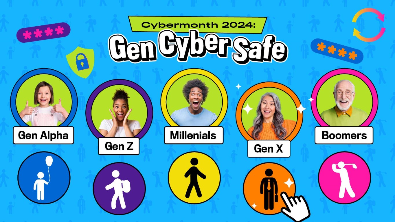
Each year during Cyber Security Awareness Month, I was able to create a distinct yet cohesive campaign visuals. Over the past three years at Banfield, I have designed a variety of concepts that effectively communicated key cyber security messages by elevating our regular campaign materials and pulling from trendy themes and design to create month-long mini campaigns educating the general public about cyber safety. These designs were crucial in engaging the public and educating them on cyber safety practices through visually stimulating and informative graphics, more than a normal month because of the larger push in October for Cyber Security Awareness month– Yes! It’s a real thing!
Videos
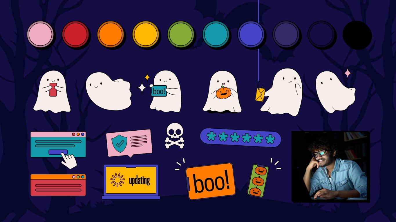
Alongside my work on static visuals, I also contributed to the conceptual stage of lyric videos by creating storyboards. This task involved considering how the design elements could be animated in future production steps. While I wasn’t responsible for the actual animation, my role required me to envision the dynamic movement of these elements to ensure they could effectively transition into motion while supporting the overall campaign’s visual strategy. I was able to work through the design and create usable assets that could be taken by our in-house video team and converted into moving pictures. The storyboards worked as both imagery to be approved by client as well as completely motion-ready assets that could be pulled apart by other teams.
Infographics
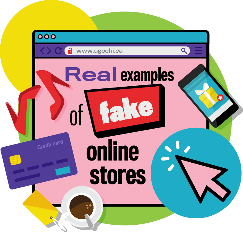
I extended the campaign’s signature bold and energetic style into a series of infographics, using dynamic layouts to make key cyber security information stand out. These designs were not just informative but visually engaging, ensuring the data was as captivating as the rest of the campaign’s visuals.
GET IN TOUCH
Call me or text me at 647.410.7843. Email me at ugochi.umeugo2@gmail.com
(or use this handy form to the right).
GET IN TOUCH
Call me or text me at 647.410.7843. Email me at ugochi.umeugo2@gmail.com (or use this handy form down here).
Ugochi Creative 2024